Python 绘制 K 线、技术指标
2019-09-21
用 Python 做量化交易,如何直观的分析行情及绘制图表 ?
创建fig对象
np.seterr(divide='ignore', invalid='ignore')
plt.rcParams['axes.unicode_minus'] = False
fig = plt.figure(figsize=(20, 12), dpi=100, facecolor="white")
获得 k 线数据
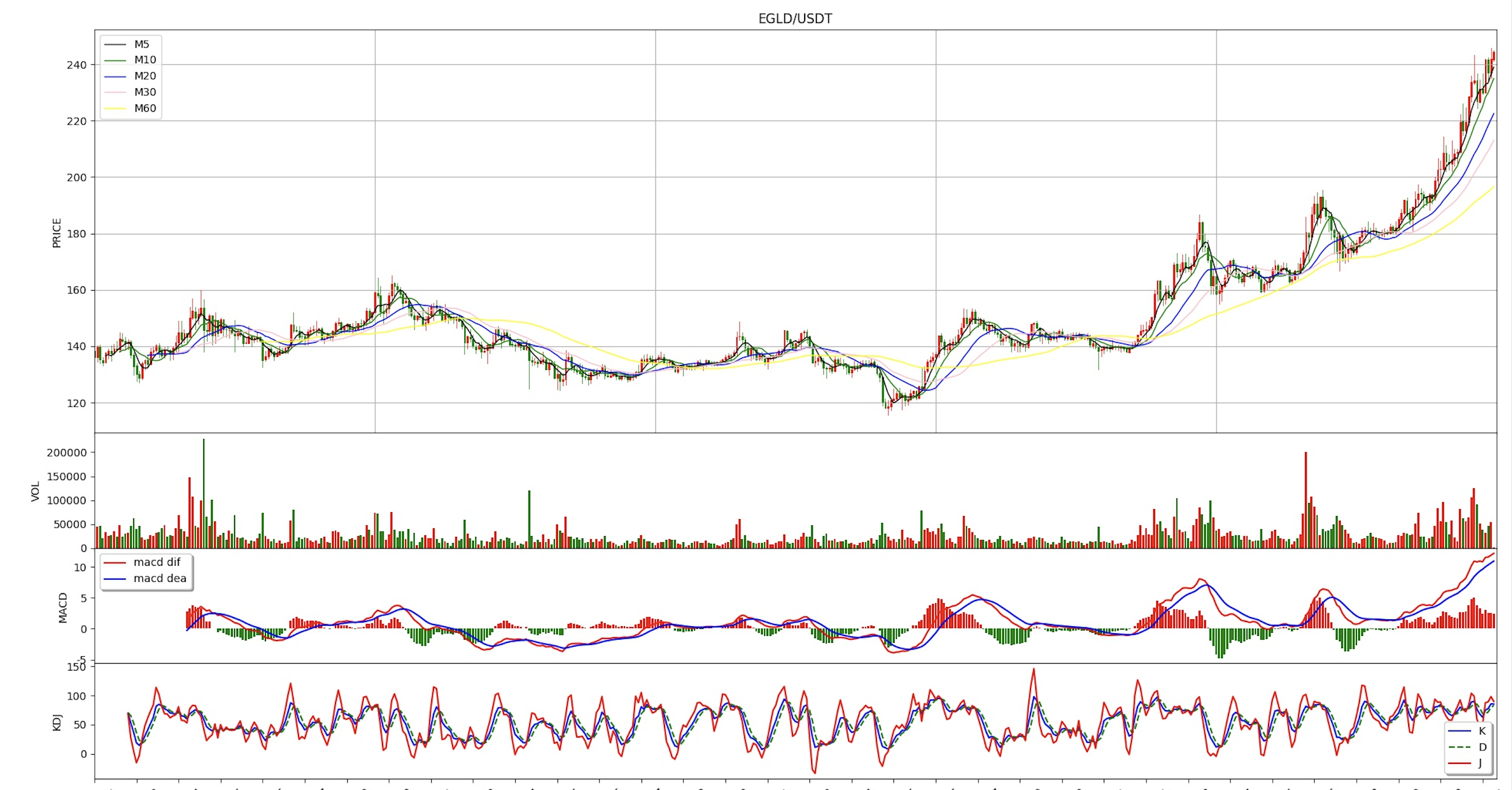
在这里我们以 EGLD/USDT 为例,获取 币安(binance)交易所的数据
symbol = 'EGLD/USDT'
interval = '2h'
exchange = ccxt.binance()

records = exchange.fetchOHLCV(symbol, interval)
利用 pandas 对数据做转化处理
df_coindata = pd.DataFrame(records)

df_coindata[0] = pd.to_datetime(df_coindata[0], unit='ms')
df_coindata = df_coindata.set_index(0)
图表布局
gs = gridspec.GridSpec(4, 1, left=0.08, bottom=0.15, right=0.99, top=0.96, wspace=None, hspace=0,
                       height_ratios=[3.5, 1, 1, 1])
graph_KAV = fig.add_subplot(gs[0, :])
graph_VOL = fig.add_subplot(gs[1, :])
graph_MACD = fig.add_subplot(gs[2, :])
graph_KDJ = fig.add_subplot(gs[3, :])
绘制移动平均线
df_coindata['Ma5'] = df_coindata[4].rolling(window=5).mean()
df_coindata['Ma10'] = df_coindata[4].rolling(window=10).mean()
df_coindata['Ma20'] = df_coindata[4].rolling(window=20).mean()
df_coindata['Ma30'] = df_coindata[4].rolling(window=30).mean()
df_coindata['Ma60'] = df_coindata[4].rolling(window=60).mean()

graph_KAV.plot(np.arange(0, len(df_coindata.index)), df_coindata['Ma5'], 'black', label='M5', lw=1.0)
graph_KAV.plot(np.arange(0, len(df_coindata.index)), df_coindata['Ma10'], 'green', label='M10', lw=1.0)
graph_KAV.plot(np.arange(0, len(df_coindata.index)), df_coindata['Ma20'], 'blue', label='M20', lw=1.0)
graph_KAV.plot(np.arange(0, len(df_coindata.index)), df_coindata['Ma30'], 'pink', label='M30', lw=1.0)
graph_KAV.plot(np.arange(0, len(df_coindata.index)), df_coindata['Ma60'], 'yellow', label='M60', lw=1.0)
绘制成交量
graph_VOL.bar(np.arange(0, len(df_coindata.index)), df_coindata[5],
              color=['g' if df_coindata[1][x] > df_coindata[4][x] else 'r' for x in
                     range(0, len(df_coindata.index))])
graph_VOL.set_ylabel(u"VOL")
graph_VOL.set_xlim(0, len(df_coindata.index))
graph_VOL.set_xticks(range(0, len(df_coindata.index), 15))
绘制 MACD
macd_dif, macd_dea, macd_bar = talib.MACD(df_coindata[4].values, fastperiod=12, slowperiod=26, signalperiod=9)
print(macd_dif)
print(macd_dea)
graph_MACD.plot(np.arange(0, len(df_coindata.index)), macd_dif, 'red', label='macd dif')  # dif
graph_MACD.plot(np.arange(0, len(df_coindata.index)), macd_dea, 'blue', label='macd dea')  # dea

bar_red = np.where(macd_bar > 0, 2 * macd_bar, 0)
bar_green = np.where(macd_bar < 0, 2 * macd_bar, 0)
graph_MACD.bar(np.arange(0, len(df_coindata.index)), bar_red, facecolor='red')
graph_MACD.bar(np.arange(0, len(df_coindata.index)), bar_green, facecolor='green')

graph_MACD.legend(loc='best', shadow=True, fontsize='10')
graph_MACD.set_ylabel(u"MACD")
graph_MACD.set_xlim(0, len(df_coindata.index))
graph_MACD.set_xticks(range(0, len(df_coindata.index), 15))
绘制 KDJ
df_coindata['K'], df_coindata['D'] = talib.STOCH(df_coindata[2].values, df_coindata[3].values,
                                                 df_coindata[4].values,
                                                 fastk_period=9, slowk_period=3, slowk_matype=0, slowd_period=3,
                                                 slowd_matype=0)

df_coindata['J'] = 3 * df_coindata['K'] - 2 * df_coindata['D']

graph_KDJ.plot(np.arange(0, len(df_coindata.index)), df_coindata['K'], 'blue', label='K')  # K
graph_KDJ.plot(np.arange(0, len(df_coindata.index)), df_coindata['D'], 'g--', label='D')  # D
graph_KDJ.plot(np.arange(0, len(df_coindata.index)), df_coindata['J'], 'r-', label='J')  # J
graph_KDJ.legend(loc='best', shadow=True, fontsize='10')

graph_KDJ.set_ylabel(u"KDJ")
graph_KDJ.set_xlabel("DATE")
graph_KDJ.set_xlim(0, len(df_coindata.index))
graph_KDJ.set_xticks(range(0, len(df_coindata.index), 15))
graph_KDJ.set_xticklabels(
    [df_coindata.index.strftime('%Y-%m-%d')[index] for index in graph_KDJ.get_xticks()])
显示图表
plt.show()